User-oriented web design
Image vs. text
Another issue to consider is using graphics for some text elements. While using a display font for menu items, logotypes and titles gives you more control over the design's personality, it creates extra work when it comes to implementing copywriting changes to titles and headings. iKnow! uses graphic type and icons for the top level navigation and logo.
There are several strategies for implementing dynamic titles as graphics, one that uses a flash file with embedded fonts. Another uses server side technology to randomly generate images, based on text entered into a content management system, using a predetermined chosen premade font and background image template.
As a general rule it is probably better to use graphic text elements as sparingly as possible, especially if you are planning to internationalize your website. At the very least this decision should be made consciously with an understanding of the amount of extra work this will generate, and if you are a small team, this may be significant. Making these kinds of decisions at the design stage will save you a lot of effort later on.
Making templates and layout style
So now that we have a color scheme, a type face combination and a general idea of which elements will be text and which will be graphics, we are ready to start thinking about the template layout and navigation style for the site. One of the first decisions to make is fixed width or liquid layout for our main template.
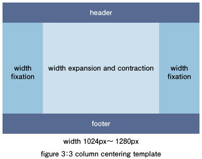
When we started iKnow! we decided to go with a semi liquid width center aligned template layout, using three columns, a header and a footer. This decision proved to be a very difficult design challenge so we quickly moved to a 3 column fixed width center aligned template. The amount of extra work generated by having to confront the design problem of varying widths everytime a new feature was introduced wasn't worth the benefit that the extra screen real estate afforded. The lesson learned here is don't be afraid to correct decisions made earlier that are not ideal. It is never too late to back out of a solution which is problematic.
The good thing is that nearly every template layout combination that you could consider using has already been solved and is available for use in professional projects under the GNU license. A quick Google search will turn up most of them. Yahoo also has an extensive library of user interface tools and layout grid templates that is worth taking a look at. http://developer.yahoo.com/yui/examples/ You might want to use the iKnow! bookmarklet to help you read the page if your English is not so strong.

Think ITメルマガ会員登録受付中
他にもこの記事が読まれています


全文検索エンジンによるおすすめ記事
- Designing web software
- Designing a social site
- How designers work with developers
- SVN on the team project development
- Introduction to Zend Studio for Eclipse
- Let's discover OpenSolaris!
- Code Gallery & Zend Platform Integration
- Team development in different area
- Package management of OpenSolaris
- ZFS and DTrace make management easy