First know your users
Last time we discussed some of the tools and processes involved in the creation of the iKnow! website. This time we will look in more detail at the design processes and the reasoning that have guided design decisions at key points in the creative development of the iKnow! website as an example for designing a visual style for your own website.
When faced with the challenge of designing with a new visual identity for a website, there are some strategies that can help you make good choices. Web design is essentially a process of decision making to achieve a good fit between the website, the users and internet technology. Having as much information as possible at the beginining of the process makes it easier to narrow down an otherwise infinite number of choices. Some of the inital design choices you will make will be what color pallette to use, the balance of colors, what typefaces to use and so on.
Doing a bit of research about the type of people who will be using your site, ie your users, is one strategy to help you narrow down the choices. Think about the kind of people who will be coming to your site and the types of activities they will perform there. Think about age, gender and social groupings. Once you have an idea of your audience, the good fit choices will become apparent. This will give you a reference point for researching the types of site designs that exist already and appeal to those users.
Next know your environment
Next up take a look around the internet to see who is doing something similar to you. It is likely that some of your potential users are familiar with some of these other sites as well. Remember that you are probably not the first to try and solve a web design problem and there are plenty of answers to be found by looking at other sites that do it well. It also may help to grab a web design annual with examples of awarded sites to get some more ideas. It is important to have a good frame of reference when you start thinking about creating a new visual identity for a website.
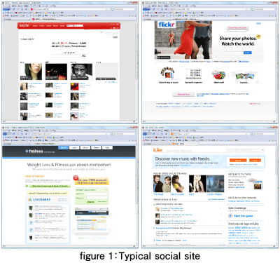
When deciding on the visual style for the iKnow! website we made a list of some of the sites that we felt matched a set of criteria. We chose sites with similar sets of features to those we planned to implement. We also chose sites that seemed to share a similar vision of providing engaging tools to users on a regular basis. Social sites like Facebook and Mixi were compared against each other as were sites like last.fm, youtube.com, traineo.com, and ilike.com. We also took a look at some photo sharing sites like flickr.com and zorg.com for more inspiration.
It also helps to make a list of sites that you don't like that much as well and try to think of the reasons why. It is probably easier to see why a color scheme, a layout or a combination of fonts doesn't work when it is not done well, than it is to see what makes a combination work when everything is in the right balance. Once you have this list take a look at each of these sites whilst thinking about how they use color, how they use icons and graphic elements, how they use typography. Most of the sites when analyzed in this way show recognizable underlying rules systems to guide their design choices.
- この記事のキーワード


