Using tabs to maximize space
Using tabs to maximize space
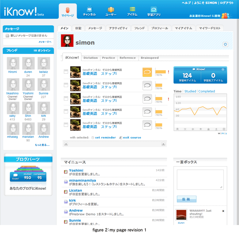
One of the most significant iteration cycles was regarding the display of courses and subsequently user lists. The main issue was that the course management, one of the most important features on the My Page, was beginning to take over the whole page for users that were studying a large number of courses. Initially we had just listed the courses one after the other, with buttons on each row to launch one of the two learning applications, iKnow! and Dictation or the learning game BrainSpeed.
In our first attempt we decided to implement a tabbed panel using two levels of navigation in a compact layout.: Pagination on one axis and application selection on the other. This allowed the user to quickly flip through courses and applications whilst allowing us to constrain the vertical height of the panel. This layout opened up some space on the right for us to show the learning badges and a progress graph. A cookie was set to remember the state of each tab so that, if a user was using the Dictation application previously, the tab would remain selected when he or she returned.
Lessons about space from listening to users
While this solution was helpful in solving some of the problems mentioned, it also raised some new ones. The main one being that on a course by course basis, progress could not be quickly assessed across all applications. This meant that those users who were using the goal-based learning option, which by the way was the only option at that time, had to flip between tabs to see their progress on a course.
Feedback from the community was significant enough to warrant a rethink, so we went back to the drawing board for another revision cycle. This is one of the benefits of the agile development process, the ability to respond quickly to user feedback and release changes to the application on a regular basis. This subsequent revision saw us grouping the profile image area together with the profile badges in the left column, bringing the course progress bars for each application up to the front again. This combined with using some smaller launch buttons, allowed users to once again get a quick overview of course progress across all applications.
As we had put a bit of effort to design the profile badge and graph the first time around, we decided to keep the code and offer them as widgets for users to take away and display on their blogs. And the work we did for the tabs was used to switch between courses and lists, which came along a few iterations later. The ability to stay agile, in both design and development, whilst being tricky at times, can result in better solutions over shorter amounts of time.
- この記事のキーワード
この記事をシェアしてください
関連記事
バックナンバー
この記事の筆者

Think ITでは、技術情報が詰まったメールマガジン「Think IT Weekly」の配信サービスを提供しています。メルマガ会員登録を済ませれば、メルマガだけでなく、さまざまな限定特典を入手できるようになります。