Users' wishes 'Please don't make me confused.'
Users' wishes 'Please don't make me confused.'
One of the greatest challenges in designing and developing a web application is making it intuitive. But what does this really mean when we say that an application is intuitive? Making an application that seems familiar and is easy to use is part of it. Knowing what is required of you at every step of the way and how to achieve your goal is another. Being able to know that a button is a button and knowing what a button will do before you click on it are yet other qualities. Essentially, what it means is that a user is able to intuit his/her way around the application without having to think too much about it.
The reason why this is so challenging is that it requires all of the elements we have considered previously to come together in the right balance. It is just as much a factor of design, color, layout, position and shape as it is behavior, responsiveness, timely feedback. The tendency is that when there are so many elements involved that need to work perfectly in harmony, the interface becomes overloaded and bland by giving equal importance to each of the elements. As we saw with limiting our color palette to achieve more impact with our application's visual identity, the same reasoning can be applied to be able to achieve a user interface which is intuitive.
The hardest part about creating something is being able to throw it away if it is not working. Creating a satisfying user experience through an intuitive interface will require that the interface become complex whilst remaining uncomplicated. It will require the ordering, by priority, of each component and it will also require the removal of those parts which are not essentially necessary. Taking elements away or merging them in order to simplify an interface will make the remaining choices clearer and more relevant.
Users' wishes 'Please don't give me extra work.'
When creating a user experience that is elegant and enjoyable, along with an intuitive interface - one that doesn't require the user to think too much, we also need to try and create an experience that doesn't require too much work to complete a task. Like the intuitive interface, this is a difficult one to master as it is also the culmination of a number of separate elements. Navigational structure is probably the most significant, specifically the size, position, shape and color of the navigational elements. Minor changes like putting spaces in between tabs can increase usage significantly.
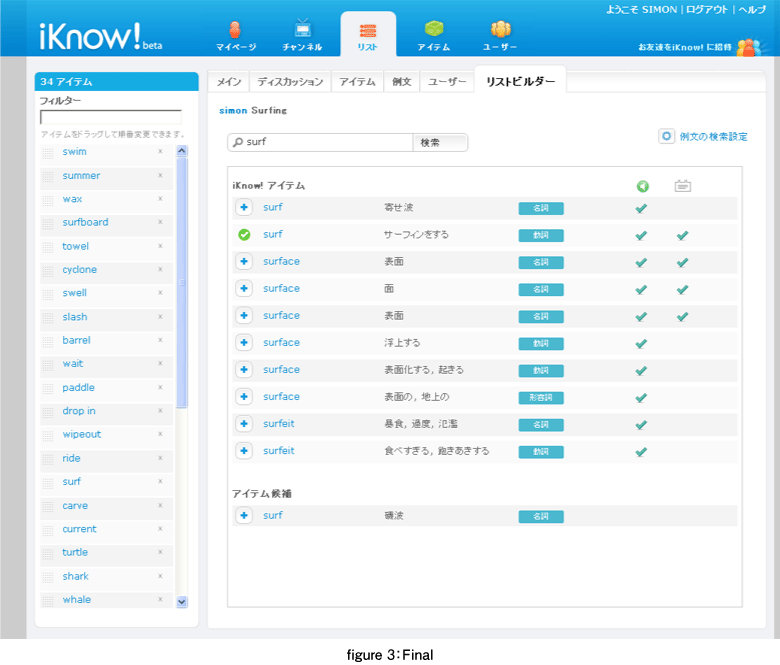
Thinking of desired user activities within the application in terms of paths or flows can help in the design process towards creating user experiences that are satisfying and effortless. Activities like sending a message, requesting a friend, starting a course, and acting on recent activity are examples of some relatively short and standard user experiences within iKnow!. Most of these activities are fairly familiar to most users and, as such, it is hard to go wrong with these. Designing the user experience of building a list was a little more tricky.
The List Builder is a place where the user can spend quite a bit of time making content for themselves or other iKnow! users. When designing the user experience for this List Builder we had this in mind and tried to make the experience as simple as possible. We used a system of layered contextual interactions that were loosely interdependent. The first action of searching for an item and adding that item to your list takes place on the first layer. This allows a user to quickly build a list filled with default content (like sentences and images) on this layer without digging in deeper. In this way a list can be quickly filled with rich content for the user who is not specifically interested in managing their items further. The second layer, that allows the user to create and attach sentences to an item, occurs in the lightbox modal window, and, as such, can be an optional step in the list building flow.
Well I guess that is about it for this series. For those of you who made it this far I say thank you and お疲れさまです. I hope it wasn't as hard for you to read as it was for me to write! And if you are interested in improving your English skills, or if you would like to watch a web application in constant review, then take a look at iKnow! and learn with us.
- この記事のキーワード
この記事をシェアしてください
関連記事
バックナンバー
この記事の筆者

Think ITでは、技術情報が詰まったメールマガジン「Think IT Weekly」の配信サービスを提供しています。メルマガ会員登録を済ませれば、メルマガだけでなく、さまざまな限定特典を入手できるようになります。