About colors
About colors
The key to making a consistent and effective visual style for a website is to utilize a limited color pallette. This simple and effective technique will cut down on your decision making and help you to develop a sophisticated and cohesive identity. The bare minimum for a reduced color pallette is usually 4 colors. There is usually one key color, a secondary color, a base color and a supplementary color. For example, a site like flickr.com uses blue for its key color which also happens to be the color for links. The secondary color is black which is used for headings and text, the base color is white and the supplementary color is pink which is used for secondary headings.
With iKnow! we decided to be a little more ambitious with the visual style and so developed a design with slightly larger color pallette. The key color is blue and the base colors are light grey and white. The text color is dark grey and the supplementary colors are orange and light blue. While it is probably beyond the scope of this article to go into any detailed color theory discussion, there are a number of online tools that can help you to come up with a color scheme that uses both complimentary and contrasting colors. One that I like to use is the Color scheme generator 2 which can be used free online to quickly generate a color pallette for a site based on a color wheel.
One of the key things to be concerned with when choosing a web color scheme is legibility. There are certain combinations of text color and background colors that can be almost unreadable. If you plan to use reversed text (a light color on a dark background), you need to make sure the background color is dark enough to show the lighter text. The same applies for dark text on lighter backgrounds, yellow is usually a problematic color on a white background for on screen text. Finding a versatile color scheme that works well in most situations may take a little trial and error, however it will save you time by limiting your choices and in effect the amount of design decision you will need to make.
Web typography
Once you have your color scheme chosen the next choice to make is about the use of typography. Just as we saw with color, limiting the number of typefaces used in a site makes the design more cohesive and the identity clearer. The number of system fonts that can be used on a website that are compatible across all platforms are very few for English text and even fewer when it comes to Japanese. There are usually only a couple of choices when it comes to working with system fonts across multiple systems. (Mac, Windows, Linux)
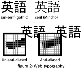
Generally there are 2 main types of typefaces, Serif (Mincho) and Sans-Serif (Gothic) . Serif gives the impression of being a bit formal and old fashioned, whereas San Serif is usually associated with more modern a less formal image. Most times it is safer to pick one or the other and stick with it. It is hard to do a mixture of both well unless you stick to some rules to guide your usage. There are quite a few web typography examples that stick to the rule of using Serif (Mincho) for titles and/or alternative title styles only while using Sans-Serif (Gothic) for the body text.
Once you have decided on your typeface (or type face combination), it may be a good idea to then come up with some common usages in an xhtml document. Using a combination of your colors and fonts, create some variations for headings, sub headings, links and body text. Create a document with all the different document font tags from h1 to h6, p and a and keep it as a reference to guide your design decisions. Designing your site’s visual identity in this way is also helpful for when it comes time to implement the design. Don't make the mistake of designing using Photoshop for web applications using anti-aliased text, as most of the finished design may be disappointing when implementing it using device fonts.
- この記事のキーワード
バックナンバー
この記事の筆者

筆者の人気記事
Think ITでは、技術情報が詰まったメールマガジン「Think IT Weekly」の配信サービスを提供しています。メルマガ会員登録を済ませれば、メルマガだけでなく、さまざまな限定特典を入手できるようになります。