Looking into other sites
This week we will be looking at what it means to design and develop web software as opposed to designing a website. Over the last 5 years or so, there has been a shift towards providing software services online. These services range from email to blogging and photo storage and management. One of the main differences between these web applications and typical websites is the richness of the types of interaction between the application and the user.
The iKnow! web application is made up of a combination of some generic and some more specific web services. When designing our services we took a look at some other sites to see their approach to these services, and also to see what we could do to improve on these, and made them more aligned with our application. At it's core, iKnow! is a Social Networking Service built around sophisticated learning applications and, as such, has a lot in common with other SNS's like Facebook and mixi.
We looked at the way these applications handle services like, messaging, blogging, image galleries, notifications and status management. These are some of the more generic types of services. Then we had some services to build which are specific to the iKnow! application like the organization and creation of custom learning content through the My List service.
For our messaging service we leaned more towards the Facebook, conversational thread approach where messages are organized by person. For our notification and news activity service on the My Page we took an approach similar to mixi's by organizing activity notifications into categorized areas.
UI・UX wireframe
One of the best tools to use when designing a web application is a clickable wireframe. A wireframe is a quick way to map out a user interface in a diagram. The good thing about a wireframe is that it allows you to only consider concerns like placement and hierarchy, while shelving other design concerns like color and message. Often times, when looking at color and design at the same time as user interface and layout, decisions get clouded by emotional responses to the color and design. This wireframe allows you to focus on more low level problems like the positioning and size of each of the elements involved.
When designing for flow, that is, for a path of interactions required to complete a task, it is helpful to take wireframe one step further and make it clickable. There are a number of ways to achieve this and, if you are handy with XHTML and CSS, it should be fairly easy to make one using nothing more than Notepad and a web browser. Another way would be to scan in some hand drawn diagrams or export them from Photoshop or some other image making software, and make them clickable using an image map.
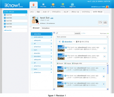
This clickable wireframe will allow you to assess a lot of issues that otherwise would not become apparent until after the feature has been built. When building the list builder interface for iKnow! we used a clickable wireframe to understand the flow of interactions used in building a custom learning list. We needed to achieve a number of goals with the list builder. The first and most important task for the user was the building of the list, which consisted of searching for items to add to the list. The secondary part of the task was the managing of sentences which are attached to the item in the list. Initial clickable wireframe work uncovered some issues and led us towards the use of a lightbox for this interface.
- この記事のキーワード


