How designers work with developers
UX/UI design work flow
The type of work that we do as designer/developers for iKnow! usually falls into one of two categories. User Interface (UI) and or and User Experience (UX). UI is more about the look and feel of the application while UX is more about how the application is used to achieve an objective. UI/UX are usually developed in response to a user need.
In the beginning of a web application's development there are some needs that are essential and others that are optional. With iKnow! most of the application's essential needs were initially specified in wire frames which became the architecture that was then handed over to developers to implement. The design team then took the wire frames and created an overall look and feel for the application.
The first task in the initial design process was to triangulate our identity in relation to others that existed already. With iKnow! we knew the type of web applications that we liked and enjoyed using the most. Sites like last.fm, traineo.com, ilike.com, magnolia.com and 37signals.com, created by the founders of Rails, were those that we liked both visually and for their UX implementations.
Then there are sites like mixi.jp, youtube.com, facebook.com that featured in parts the type of interaction we wanted to implement but not in the exact way we had imagined. The initial design process was then a matter of taking the styles and design conventions that we liked from these sites and making them work within the architecture and conceptual framework of our own application. This gave us a UI that was both familiar whilst having a unique identity.
Once the look and feel was agreed upon at the Photoshop level, the next task was implementing the design in XHTML/CSS. There are a number of reasons for choosing an XHTML/CSS solution, not the least being the ability to take a modular approach to interface and control multiple instances from a central location, ie the stylesheet. On the down side there are a lot of discrepancies in the implementation of css across different browsers so that testing and cross platform support can become very time consuming.
The 3 column center aligned template that we used came from an open source codebase that had been tested against multiple browser configurations.Wherever possible it is better to not reinvent the wheel when it comes to template design, as a solution that has been tried and tested by a larger community is always going to be more robust and will end up saving you time spent on cross browser compatibility in the end.
The main development design tool
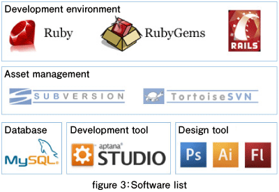
So let's take a look at some of the tools we use to create iKnow! on a daily basis.For the UI and UX development we use the image creation, manipulation software Adobe Photoshop. Photoshop has a broad tool set that allows us to create production ready artwork for interface elements. It also has great slicing and image export and optimization tools that allow you to also export the individual graphic elements that are referenced in the stylesheets.
As mentioned earlier, we also use Aptana Studio which whilst allowing us to maintain a local copy of the web application to develop with, also comes with great css auto completion that predicts the stylesheet declaration attributes and element properties as you type. The only application this feature set that rivals Aptana's would be Adobe Dreamweaver. This makes hand coding XHTML/CSS less time consuming and more intuitive and makes it easier to remember the thousands of attributes applicable to any xhtml document.
The final stage of development takes place in Mozilla Firefox using the Firebug addon. Fire bug provides a wysiwyg (what you see is what you get) interface for inspecting different elements within a page and lets you apply changes to the stylesheets directly. It also displays the inheritance cascade of all styles that are applied to a specific DOM element along with a line number and the stylesheet filename.
This is handy for accurately pinpointing a style and when in used in combination with Aptana's open file (ctrl + shift + r) and go to to line (ctrl + l) features becomes a very efficient file navigation tool. This is especially useful when navigating through 1000's of lines of stylesheet code. Other supported browsers are then tested for compatibilty.
Next time we will be looking in more detail at the design process focusing on knowing your users and knowing your space and how that influences design decisions like choice of color shape and typography. We will see how these elements combine to create a unique visual identity and a satisfying brand experience. I hope you enjoyed this article look forward to catching you here next week.
Think ITメルマガ会員登録受付中
全文検索エンジンによるおすすめ記事
- User-oriented web design
- Designing web software
- Designing a social site
- Code Gallery & Zend Platform Integration
- Introduction to Zend Studio for Eclipse
- SVN on the team project development
- Team development in different area
- Let's discover OpenSolaris!
- ZFS and DTrace make management easy
- Package management of OpenSolaris


