Research on My Page
In the first article we covered some of the tools and processes used in the development of iKnow! In the 2nd article we took a look at what was involved in creating a unique Visual Identity by limiting our design variables and making strategic choices. In this 3rd article we are going to take a look at some of the general conventions used in social websites. We will also take a look at some of the design decisions involved in creating the iKnow! My Page, then finally we will take a look the integration of some open source presentation layer technologies to make our life easier and our site richer.
One of the most challenging pages to design in iKnow! was the My Page. My page is the first page that you see after creating an account or returning after you log in. Rather than try to re-invent the wheel and come up with an entirely original solution, we took a look around at some other social sites, to see what we could learn, and then applied it to our My Page. We learned from sites like Facebook and Mixi about the type of features that are considered "bread and butter" SNS features. We noticed by looking at MySpace and Facebook in particular, that there was the possibility for a lot of clutter. We also knew that in our case, managing learning and displaying progress were a high priority.
Designing a balanced my page
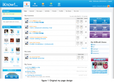
Most design is a process of attempting to find a good balance between numerous required elements and environmental constraints. The biggest challenge when designing the main page of the My Page section of iKnow! was to display a significant amount of information within a limited space. Finding the right balance of elements came out of the process of creating a hierarchy of elements based on importance and or significance. We needed to find the right balance between the management of learning content, the display of study progress along with the more traditional features like messaging, friend management and site activity.
The secondary navigational structure of the site is one that features a horizontal line of tabs. This navigational element allows us to position the My Page menu in a prominent place. This also means that all available menu items are in full view all of the time. This was important as we were trying to pioneer a new type of service and wanted to make sure that new users could clearly see what was available. Even another benefit was that it allowed us to organize the features of the My Page by pulling up relevant overviews like new notifications and messages, friends' requests and friends' activity to the main page and pushing more detailed information down deeper into the site.
Every iteration over a period of 3-4 months saw some sort of layout revision to the My Page. With the general framework in place (tabbed secondary navigation, 3 column template ), we set about building the rest of the basic feature set including an activity stream, conversational type messaging, a shoutbox, a personal status field, and a list of recent comments and bookmarks. Every time a new element was introduced, the page was tweaked and massaged to handle the new elements.
- この記事のキーワード


