Blend4でのGotoStateActionの設定
Blend4でのGotoStateActionの設定
GotoStateActionアクションを使用してトリガーを指定します。BlindsButtonと状態のBlinds、SmoothSwirlGridButtonと状態のSmoothSwirlGrid、WaveButtonと状態のWaveを関連付ける、GotoStateActionアクションを設定します。
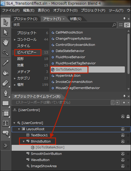
「アセット」パネルから「ビヘイビアー」を選択し、GotoStateActionアクションを「オブジェクトとタイムライン(B)」内のBlindsButton上にドラッグ&ドロップします。BlindsButtonの子としてGotoStateActionが追加されます(図21)。
|
|
| 図21:GotoStateActionをBlindsButton上にドラッグ&ドロップする |
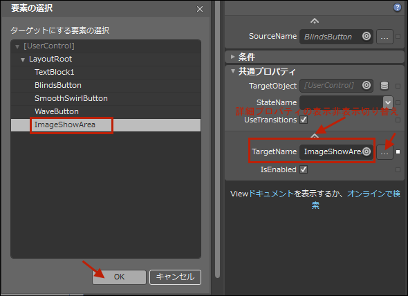
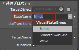
BlindsButtonの子として追加されたGotoStateActionのプロパティを設定します。[トリガー]内のEventNameが「Click」になっているのを確認してください。次に、TargetNameプロパティの横に付いている[…]ボタンをクリックします。「要素の選択」画面が表示され、要素の一覧が表示されます。「ターゲットにする要素の選択」にImageShowAreaを指定します(図22)。ImageShowAreaはTransitionEffectImageShowに付けたx:Nameです。[共通プロパティ]内のStateNameに、BlindsButtonがクリックされた時の状態である、Blindsを選択します(図23)。必ず先にTargetNameプロパティを設定してから、StateNameを選択してください。TargetNameを指定していない場合は、StateNameに何も表示されませんので、注意してください。TargetNameプロパティは「詳細プロパティの表示」をクリックすると表示されます(図22)。
|
|
| 図22:TargetNameプロパティの値を「ターゲットにする要素の選択」内から指定する(クリックで拡大) |
|
|
| 図23:StateNameプロパティの値を選択する |
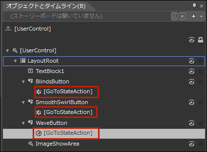
以上の手順でSmoothSwirlGridButtonとWaveButtonにGotoStateActionを追加し、それぞれのプロパティを設定していきます。TargetNameには全てImageShowAreaを指定します。
全て設定すると「オブジェクトとタイムライン(B)」内の各Buttonの子としてGotoStateActionが追加されています(図24)。
|
|
| 図24:各Buttonの子としてGotoStateActionが追加されている |
以上でBlend4の設定は全部完了です。Blend4の操作を終わり、VS2010に戻ります。
MainPage.xaml内にTransitionEffectImageShowButtonユーザーコントロールを取り込む
ソリューションエクスプローラー内からMainPage.xamlを選択します。
|
|
| 図25: |
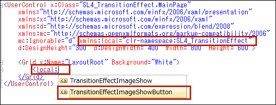
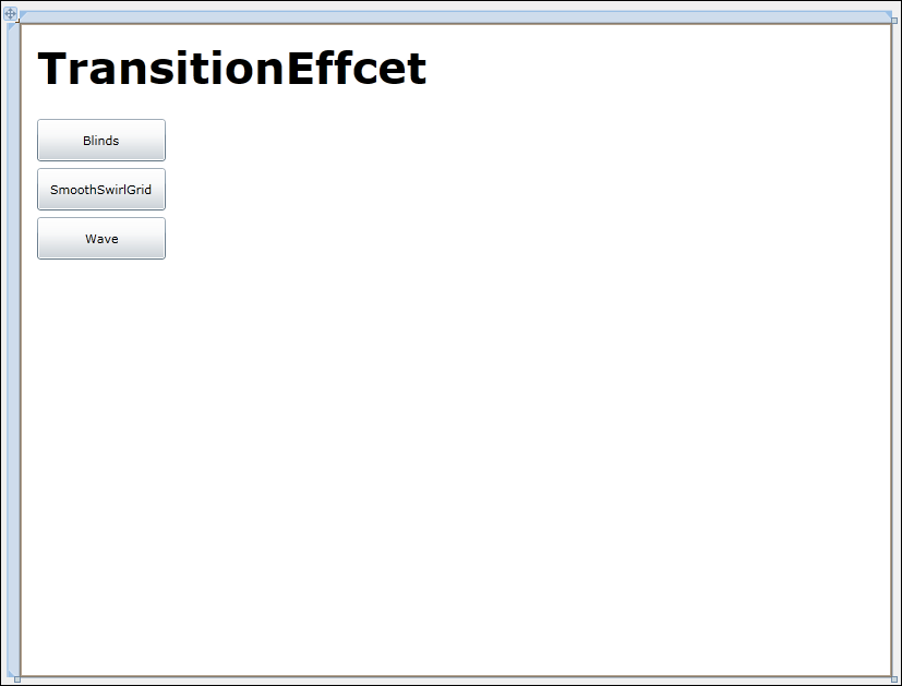
するとMainPage.xamlのデザイン画面に3つのボタンの並んだTransitionEffectImageShowButtonユーザーコントロールが表示されます(図26)。
|
|
| 図26:MainPage.xamlのデザイン画面にTransitionEffectImageShowButtonユーザーコントロールが表示された(クリックで拡大) |
VS2010メニューの「デバッグ(D)/デバッグ開始(S)」と選択して実行してみましょう。どうですか?うまくTransitionEffect効果が機能しましたか?ほかにもいろいろなTransitionEffectが用意されていますので、今回の手順で各自が試してみてください。
書き出されるTransitionEffectImageShowButton.xamlのコードはリスト2です。
リスト2書き出されたXAMLコード(TransitionEffectImageShowButton.xaml)
  <UserControl
    xmlns="http://schemas.microsoft.com/winfx/2006/xaml/presentation"
    xmlns:x="http://schemas.microsoft.com/winfx/2006/xaml"
    xmlns:d="http://schemas.microsoft.com/expression/blend/2008"
    xmlns:mc=http://schemas.openxmlformats.org/markup-compatibility/2006

  (1)localという名前空間を宣言しています。
    xmlns:local="clr-namespace:SL4_TransitionEffect" ■(1)
    xmlns:i="http://schemas.microsoft.com/expression/2010/interactivity" xmlns:ei="http://schemas.microsoft.com/expression/2010/interactions" x:Class="SL4_TransitionEffect.TransitionEffectImageShowButton"
    mc:Ignorable="d"
    d:DesignHeight="300" d:DesignWidth="400" Width="800" Height="600">

    <Grid x:Name="LayoutRoot" Background="White">
      <TextBlock Height="62" HorizontalAlignment="Left" Margin="16,12,0,0" x:Name="TextBlock1" Text="TransitionEffcet" VerticalAlignment="Top" Width="390" FontSize="40" FontWeight="Bold" />

  (2)各Buttonに<ei:GotoStateAction>要素が記述され、TargetNameとStateNameプロパティが設定されています。
      <Button Content="Blinds" Height="39" HorizontalAlignment="Left" Margin="16,88,0,0" x:Name="BlindsButton" VerticalAlignment="Top" Width="118" >
      <i:Interaction.Triggers>
        <i:EventTrigger EventName="Click">
          <ei:GoToStateAction TargetName="ImageShowArea" StateName="Blinds"/> ■(2)
        </i:EventTrigger>
      </i:Interaction.Triggers>
    </Button>
    <Button Content="SmoothSwirlGrid" Height="39" HorizontalAlignment="Left" Margin="16,133,0,0" x:Name="SmoothSwirlButton" VerticalAlignment="Top" Width="118" >
      <i:Interaction.Triggers>
        <i:EventTrigger EventName="Click">
          <ei:GoToStateAction TargetName="ImageShowArea" StateName="SmoothSwirlGrid"/>■(2)
        </i:EventTrigger>
      </i:Interaction.Triggers>
    </Button>
    <Button Content="Wave" Height="39" HorizontalAlignment="Left" Margin="16,178,0,0" x:Name="WaveButton" VerticalAlignment="Top" Width="118" >
      <i:Interaction.Triggers>
        <i:EventTrigger EventName="Click">
          <ei:GoToStateAction TargetName="ImageShowArea" StateName="Wave"/>■(2)
        </i:EventTrigger>
      </i:Interaction.Triggers>
    </Button>

  (3)TransitionEffectImageShowユーザーコントロールを取り込んでいます。x:NameにはImageShowAreaと指定しています。
    <local:TransitionEffectImageShow x:Name="ImageShowArea" Width="640" Height="480" Margin="140,88,20,32" /> ■(3)
  </Grid>
</UserControl>
ロジックコードはありません。
- この記事のキーワード
バックナンバー
この記事の筆者

筆者の人気記事
Think ITでは、技術情報が詰まったメールマガジン「Think IT Weekly」の配信サービスを提供しています。メルマガ会員登録を済ませれば、メルマガだけでなく、さまざまな限定特典を入手できるようになります。
